

The Buffalo Sabres have unveiled a pair of logos that will be used during the 2019-20 season to commemorate their 50th anniversary in the NHL. In this article, we’ll also take a closer look at the half-century celebration of their expansion cousins, the Vancouver Canucks.
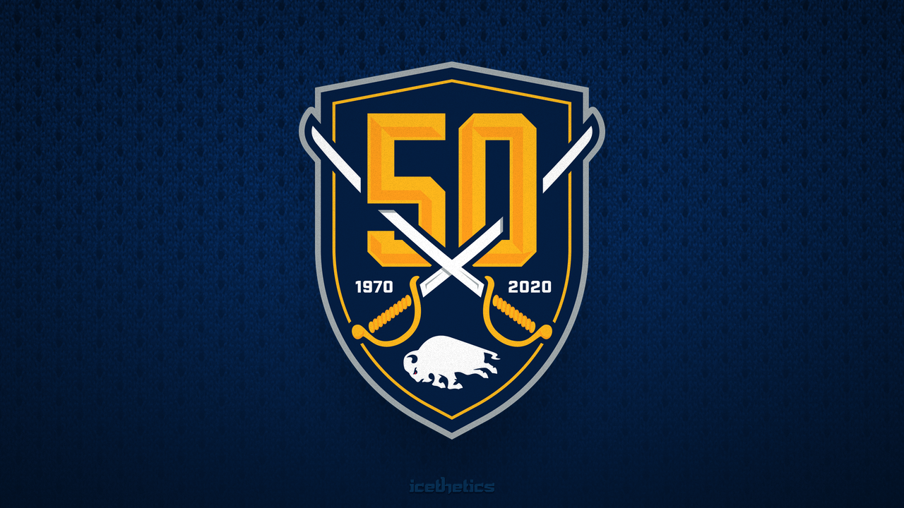
The new Sabres marks were released this morning. The primary version (left) features a shield design with crossed swords and a modernized version of the white leaping bison along with a gold “50” set in the same style as the team’s jersey numbers.
From the team’s official website:
Owners Terry and Kim Pegula tasked executive vice president of creative services Frank Cravotta and his design team to develop a logo and a patch for the occasion.
"We did a lot of research," Cravotta said. "Simplicity for Kim and Terry is key. You see some of these [logos other teams have created] that have very complex designs. They wanted it kind of stripped down, clean, and simple."
The new logo was first seen over the weekend when season ticket holders began receiving what appeared to be refrigerator magnets that featured the design. Immediate response on Twitter from fans was mostly mixed. Some fans continue to insist the Sabres resurrect the royal blue the team wore through its first 25 years.
However, I can understand why the team has consistently chosen not to do so. For one thing, navy blue provides better contrast against the gold secondary color. And for another, royal blue is the primary color of choice for both of New York’s other two teams, the Rangers and Islanders. This isn’t to say a throwback design wouldn’t make for a welcome third jersey. I’d love to see that. But let’s let that be that.
Another welcome design update would be a simplification of the primary logo. The silver outline that wraps itself around every element of the mark like an invasive vine has never been needed. And if ever there was an excuse to let it go, their 50th birthday seem as good as any.
To that end, take a close look at the other 50th logo the Sabres released today.

It’s a simplified design, probably well-suited to a jersey patch to be worn throughout the year. But that hasn’t been decided at this point, according to the Sabres’ website.
The placement of the patch on the jersey has yet to be determined. It may also appear as a decal on the players' helmets and Cravotta hopes that the team's goaltenders will take the look into consideration when they design their masks for the new year.
But really, the highlight for me is that primary logo simplified logo in the center. Is that a beauty or what? Compare the current mark with that one below.
I get why the silver piping was added in 2008. It brings a bit of glitz to an otherwise flat logo. But take a look around the graphic design landscape these days. Flat is in. Plus, it just looks cleaner with a timelessness that’s needed in sports design.

The other problem with the silver outline (which sits outside a navy blue outline) is that it makes the edges of the logo look a bit blurry, particularly at small sizes — which is likely why the design team went without it for its placement in the 50th logo in the first place.
While we’re making comparisons, let’s make another. If you’re going to clean up the Sabres mark, you might as well go all the way. If you polish up the lines of the bison, it does wonders. Seriously, look.

The design on the left is the existing bison which has basically been in use since the beginning in all its indistinct glory. You don’t need those amorphous blobs for the nose and ears. We get it. And the action lines are straight out of a bad comic book. Let’s drop what we don’t need and accentuate what we do.
On the right is a close-up of the version of the bison seen in the primary 50th anniversary logo — which actually made its debut as the shoulder patch on the Sabres’ 2018 Winter Classic jersey. My point being, the design work has already been done. Just needs to be implemented. Look at that red eye!
All right, I’ve now spent way too much time talking about the Sabres. I promised to include the Canucks.

They're also turning 50 next year. But their logo is quite different. For one thing, it’s a single color. And it’s subtle. Plus, it’s been around for some time now. The team unveiled it earlier this year on Feb. 23.
Vancouver’s logo is somewhat similar to Buffalo’s in that it utilizes the team’s jersey numbers for the “50” but with a twist. The top half of the “5” has been redrawn in the shape of the hockey stick blade from the team’s secondary mark. The space between the numbers can be seen as the shaft. It’s a throwback to the club’s original 1970 logo but this particular design comes from the 2007 update.
Filling out the logo are the years 1970 and 2020 along with the Canucks’ primary logo centered in between. Everything just sort of floats there. None of the elements are tied together, which makes me wonder how it will work as a jersey patch — or if it even will.
The rather flat design takes on a third dimension in its video animation, which shows us that every color the club has ever used over the decades — and they’ve used pretty much all of them — is represented and stacked beneath. That adds a cool touch, though it’s only useful in video applications.

I’m curious to see how the marketing team implements it across other campaigns and platforms.
And there we are. One hundred years of hockey between these two clubs and not a single Stanley Cup championship between them. It’s a shame because both have come so close. I admit I was rooting for the Dallas Stars in 1999 but I can see why Brett Hull’s skate was a tough pill to swallow. And I moved to Seattle the year the Canucks last went to the finals in 2011. I was really pulling for them so it was heartbreaking to see them shut out in Game 7 at home.
Your turn. What do you think of each of these logos?
